Quick demo
Welcome to GeCoViz,
an online resource for fast and interactive analysis of
genomic context conservation, covering 42 million genes and 12,221
reference prokaryotic species spanning the entire bacterial and
archeal phylogeny. GeCoViz permits to explore the genomic
neighbourhood of virtually any prokaryotic gene, orthologous group
(KEGGs, eggNOGs), or protein family (PFAM) from an evolutionary
perspective, allowing users to identify conserved neighbouring genes
at any level of phylogenetic resolution. To facilitate the
interpretation of genomic contexts, GeCoViz provides a guiding
phylogenetic tree relating the selected genomes, gene colouring
options based on multiple sources of functional annotation and custom
genomic conservation thresholds and scaled representation of gene
lengths and genomic distances. The resulting graphics can be
downloaded as scalar vector images for publishing purposes. Overall,
GeCoViz offers an easy-to-use, comprehensive and fast interactive
web-based tool for investigating the genomic context of prokaryotic
genes and functions.
The video bellow you can briefly presents an example on how to use this tool:
The video bellow you can briefly presents an example on how to use this tool:
Searches
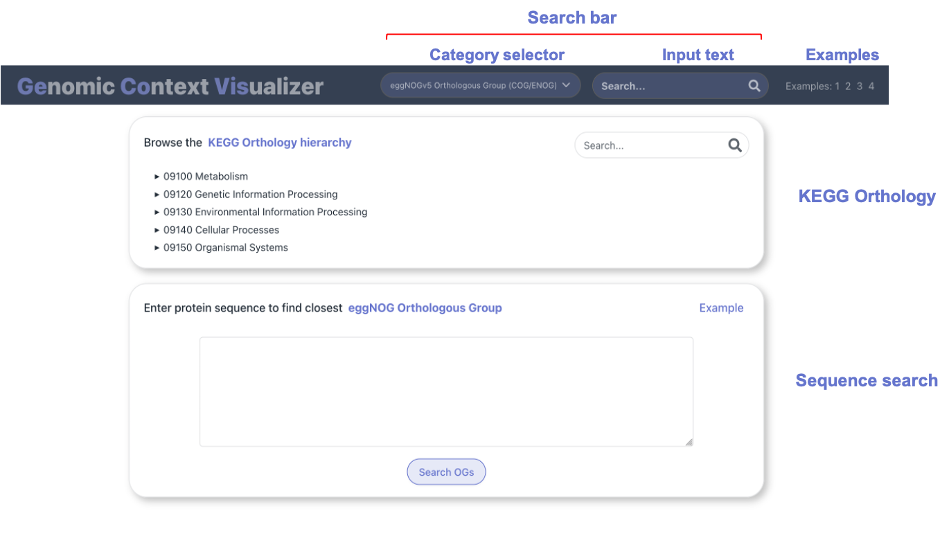
In the home page, you can find two
panels, that allow to either:
- Browse the KEGG Orthology hierarchy.
- Enter a custom sequence. After mapping it to eggNOG Orthologous Groups, you can visualize their genomic context.
On the other hand, explicit searches can be performed by using
the search bar
on the website's navigation bar. Through the selector on
the left, choose the category that matches the functional term of
interest, which could be entered in the text input on the right.
Functional terms may belong to the following categories:
- Gene / protein name.
- Orthologous Groups (KEGG KOs, eggNOG OGs).
- PFAM protein families (query by PFAM names)
PLEASE USE THE SUGGESTION ENTRIES IN THE SEARCHBAR WHEN PROVIDED
Taxonomy selector
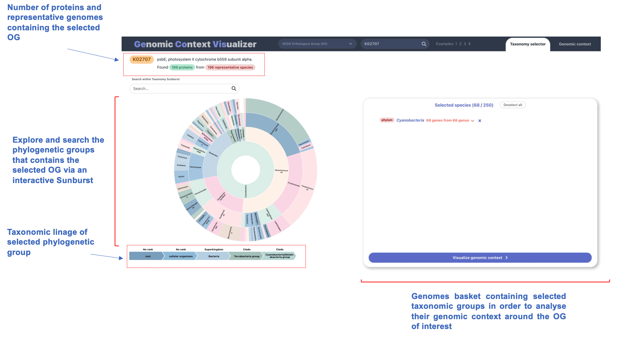
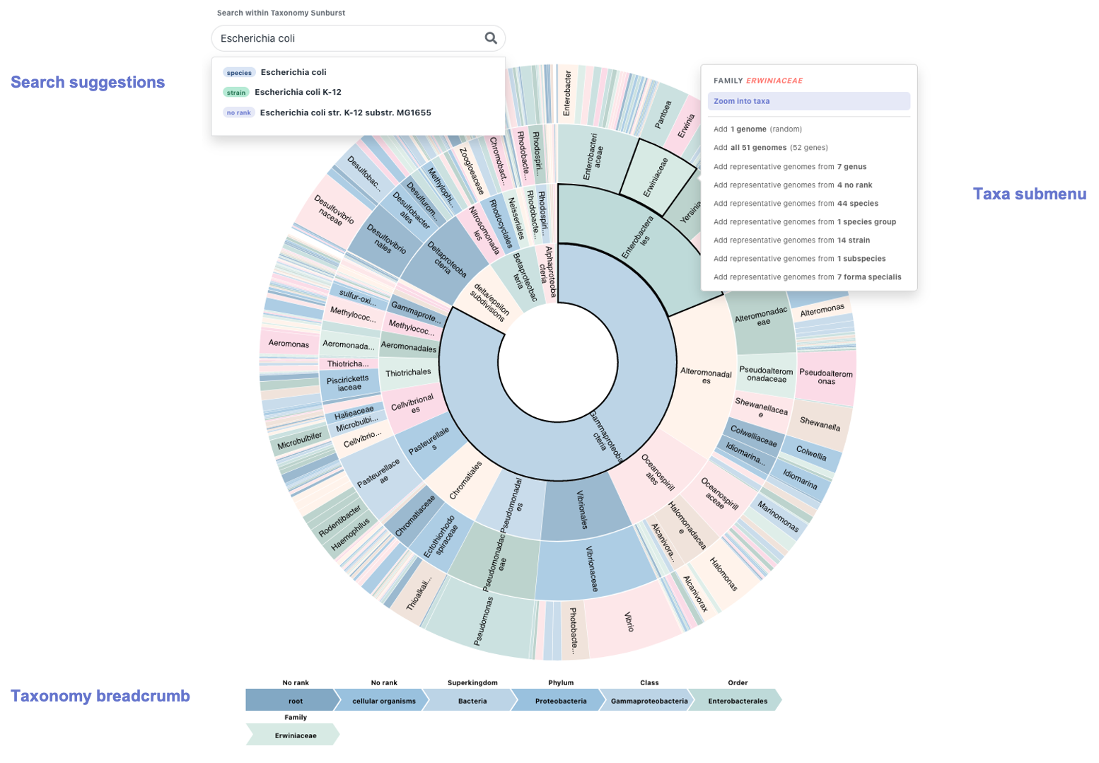
An interactive, dynamic, zoomable sunburst acts as the
taxonomy selector in GeCoViz.
Thanks to its hierarchical structure, a sunburst seems an intuitive way to display a phylogeny, in this case, of the genomes in which we find a "hit" (gene associated) to a functional term or orthologous group of interest.
The sunburst selector is highly interactive and four different items comprise it:
Search bar: allows to perform searches on the sunburst. While typing a taxa of interest, a list of suggestions drops down. Choose the one that fits the criteria and the sunburst will dynamically zoom into the selected taxa, highlight it and its submenu will appear (from which you can perform a number of actions, see below).
Sunburst: the graph itself is interactive. Hover over a tile and the breadcrumb will update to display the whole taxonomy of the taxa represented by that tile. Click on the tile to toggle the submenu associated with it.
Submenu: toggled on a particular taxa. It allows to zoom into such taxa (dynamically modifying the sunburst) as well as to add genomes belonging to it. There are several ways to add genomes to the genome basket. We can choose one genome (at random) that belongs to such taxa, all of them (if it doesn't surpass the limit) or choose the so-called "representative genomes from X taxonomic levels". As an example to the last option, adding representative genomes from 7 genus means adding one genome (at random) for each of the 7 genus that have matches under the selected taxa.
Breadcrumb: located at the bottom of the sunburst. It dynamically portrays the full taxonomy of the taxa that has been selected or hovered on. Moreover, it remains fixed when we zoom in a particular taxa, which is particularly helpful as it allows the user to better orient themselves in the graph.
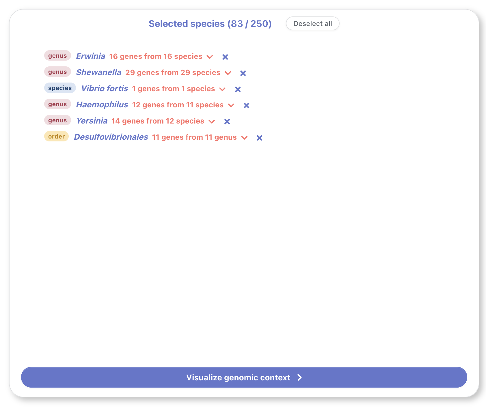
The genome basket shows a summary of the selected genomes
from different taxa. These genomes can be added from the
sunburst's submenu (see sunburst > submenu). A similar
submenu can be toggled by clicking on the downwards arrow in
any basket entry, allowing the user to modify the number of
genomes that will be shown for that taxa.
A maximum of 250 genes can be selected in total. This upper limit is set for user experience, to avoid excessive scrolling when visualizing the genomic context (a global view is helpful when infering functional conservation) as well as to mantain high browser performance and quick response time to user interaction.
Once we have finished selecting the desired genomes, we can click on the button on the bottom to visualize their genomic context.
Genomic context visualizer
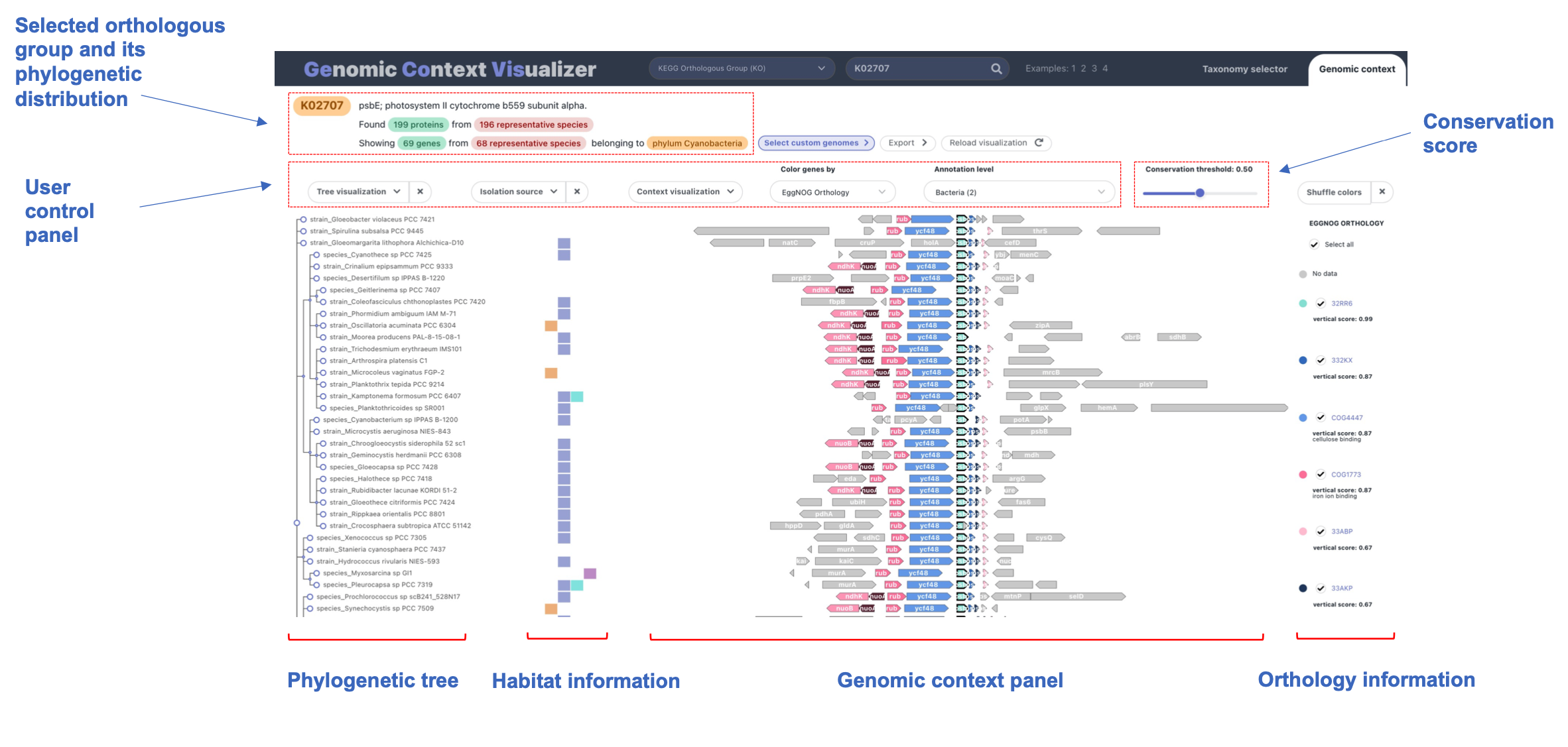
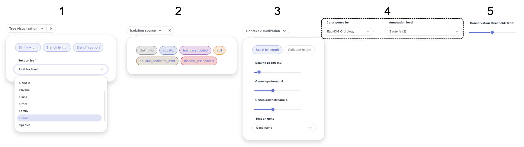
1. Tree visualization
The phylogenetic tree on the left of the graph
(see overview) can be modified in several ways.
Its width can be shrunk (for a more compact
visualization) and the branch length and support
can be shown or hidden at user's discretion.
Lastly, the text displayed on the leaves can be
modified. As every leaf node has a taxonomy
associated, the taxonomic level that is shown on
the tree can be selected.
2. Isolation source
Each genome may have an isolation source
associated. We can then filter genomes by their
isolation source, by switching on/off the checkboxes shown
in section 2 of the figure above. Furthermore,
this panel acts as a legend to the isolation
source plot.
Note: genomes with unknown isolation source
can be filtered out by switching off the
"Unknown" checkbox
3. Genomic context
The genomic context visualization (central panel
in graph. See a) can be customized in
several ways:
- Gene size: gene length and distance can be scaled to depict genomic dimensions (activated by default). We can zoom in and out by means of the zoom slider.
- Height collapsing: gene height can be collapsed to fit a greater number of genomes in the screen. Although less detailed (text on leaves and genes will not be seen), this view can be particularly useful if we are studying a relatively elevated number of genomes.
- Number of genes in neighborhood: the number of genes upstream and downstream to the anchor/central gene can be modified independently. A maximum of 10 genes can be visualized on each side.
- Text on gene: although the most common setting is to show their gene name, the text displayed on genes can be chosen.
3. Color by function
Genes can be colored by different functional
annotations. This selector allows us to seemingly
transition from one to another, obtaining a more
comprehensive view of the gene-of-interest
neighborhood.
Among those functional terms, we can color genes
by:
- KEGG pathways
- KEGG Orthology
- EggNOG Orthology
- Pfam domains
4. Conservation threshold
Genes are colored by functional terms. However,
to better assess functional conservation, these
terms can be filtered by
vertical conservation.
By default, the conservation threshold is set to
50% but it can be easily modified by using the
slider in the control panel.
Vertical conservation = genomes with functional term in neighborhood / total genomes
Four highly interactive panels comprise the genomic context graph produced
by GeCoViz.js, from left to right:
a phylogenetic tree, isolation source information, genomic
neighborhood and a legend for the latter.
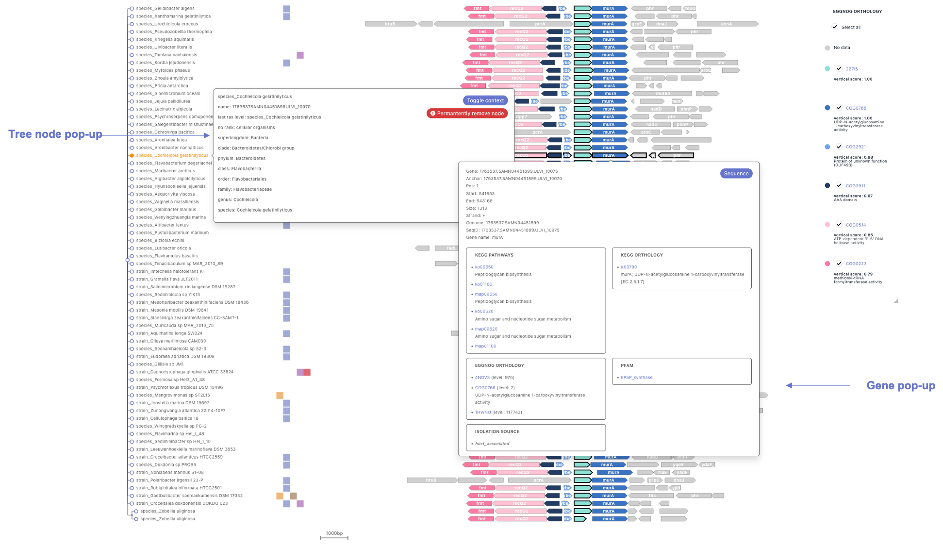
Phylogenetic tree
The phylogenetic tree on the left of the graph
provides an evolutionary perspective to the
genomic context conservation analysis.
Hover over any node (leaf or internal) to highlight the information associated to it: children nodes, genomic neighborhoods and isolation sources.
Click on any node to trigger their pop-up. This pop-up contains a complete taxonomy lineage and two buttons that allow to either: collapse their genomic context (whole clades may be collapsed by performing this action on an internal node, shortcut Alt + Click), or permanently remove a node (may be useful when trimming the graph for publication purposes).
Isolation site and pathogenesis
This panel shows isolation site and
pathogenesis from
Progenomes,
providing a potential ecological
interpretation of the displayed genomic context.
Below, we provide a legend for all of the
eight distinct classes:
- soil
- aquatic
- aquatic freshwater
- aquatic sediment mud
- host associated
- host plant associated
- food associated
- disease associated
Genomic context
The genomic context graph shows a default
neighborhood with four genes up and
downstream to the gene of interest
(vertically aligned and highlighted with
a thicker border). Moreover, genes and their
distances are scaled to their genomic
dimensions. A myriad of features can be
modified from the control panel (see
documentation).
Genes are colored by their associated functional terms (eggNOG orthologous groups by default). However, only those terms that surpass the vertical conservation treshold (defaults to 50%) will be shown. This filter facilitates the assessment of functional conservation along the graph.
Hover over any gene to highlight the information associated to it: other genes with same functional annotation (very useful when studying conservation), corresponding legend entries, isolation source and their associated node in the tree.
Click on any node to trigger their pop-up. This pop-up contains a more complete description of the gene's functional annotation. Moreover, its sequence may be downloaded from this container for further analysis.
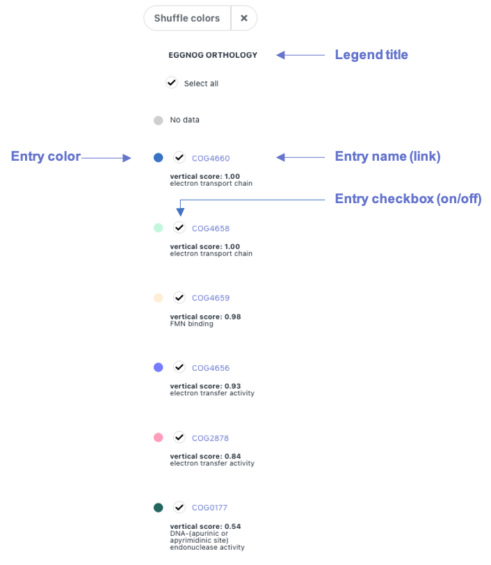
The dynamic legend for gene color by functional term
is displayed on the right side of the
graph (see overview). To hide it, click on the close
button "X" on top. Colors can be shuffled by clicking on
the corresponding button.
Legend entries are functional terms from the category specified on its title, EggNOG Orthology in this example (may be changed from the control panel, section 4). These entries are ordered by their vertical conservation, and they can be hidden (remove color from genes in the genomic context graph) by clicking on their checkbox between their color and name.
Legend entry names are links to their corresponding website. Vertical conservation and their description (if any) are shown below.
Hover over entries to highlight genes with such functional term associated.